
Supreme
Project Overview
About this Project
Supreme, originally a skateboarding brand, has gained immense popularity due to its clothing range and iconic box logo items. The brand’s products are highly coveted, often leading to a thriving resale market driven by the hype surrounding Supreme. However, this has also led to concerns among buyers about the authenticity of items sold by resellers.
For this project, I aimed to revamp Supreme’s online website, enhancing its functionalities and overall user experience. Additionally, I developed a digital service that aids both resellers and buyers in verifying the authenticity of Supreme products. This initiative is designed to provide peace of mind to buyers and support the integrity of the resale market.
Project Start Date: April 22nd 2024 | Project End Date: June 24th 2024
Planning
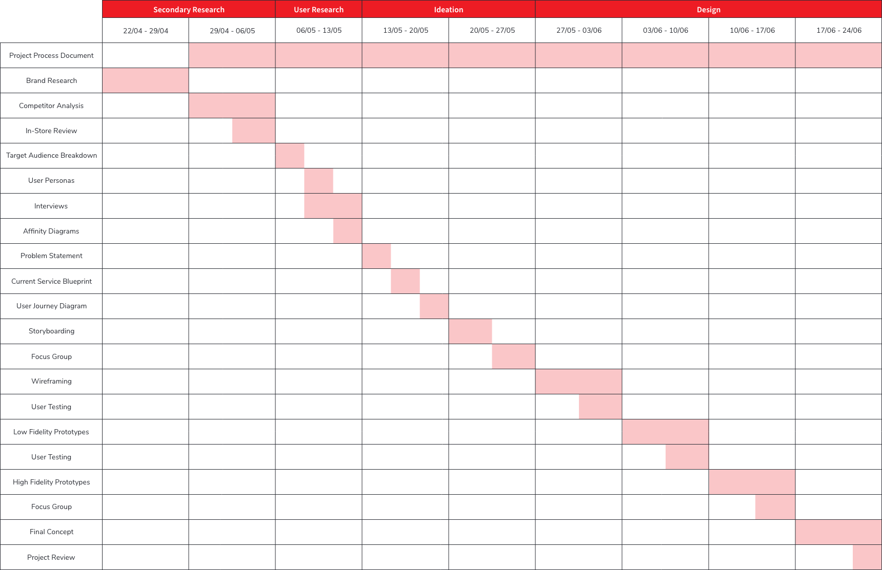
Weekly Schedule
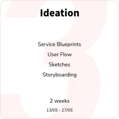
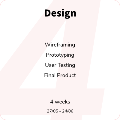
To organise and manage this 9 week project effectively, I created a straightforward Gantt chart outlining my activities. I divided the project into four distinct sections, each with its own start and end dates. This structured approach facilitated my project management by keeping me aware of self-imposed deadlines and ensuring timely progress throughout the project.


Secondary Research
Brand History
With my project planning complete, I began the research phase. My initial goal was to gain a deeper understanding of the brand, including its history, branding, and general reputation. I felt that this was important as Supreme isn’t an ordinary clothing brand, hence why it needed some added attention.
During the first part of the week, I focused on researching the brand’s history. After several hours of research and note-taking, I created a timeline to provide a clearer visual representation of Supreme’s evolution based on my findings.

Competitor Analysis
To better understand Supreme’s position in the market, I explored two of its key competitors: Stüssy and Palace. I focused on their products, target audiences and the general perception of each brand, allowing me to identify how they differ from one another. By identifying the strengths and weaknesses of each brand, I could make more informed decisions about what to include or avoid during the ideation phase of the project. To visualise these comparisons, I created a Venn diagram highlighting areas of overlap and distinction between the three brands.
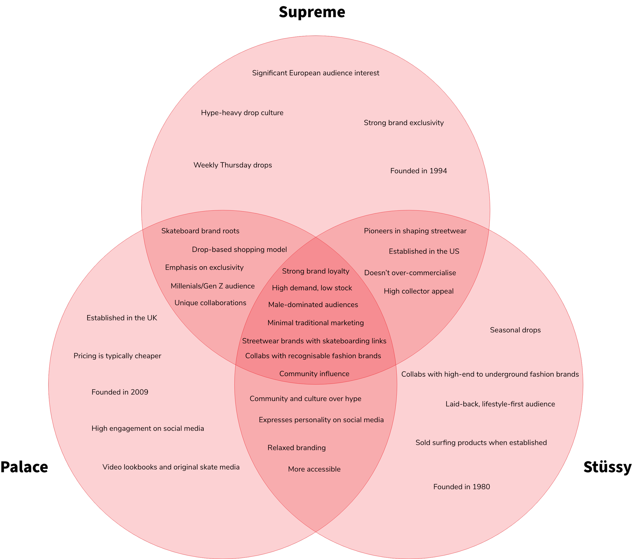
I reflected back to this venn diagram throughout the ideation and design phase of the project, not only to be aware of Supreme’s competitors and the comparison with them, but also to keep align with Supreme’s core values, which I intended to keep.
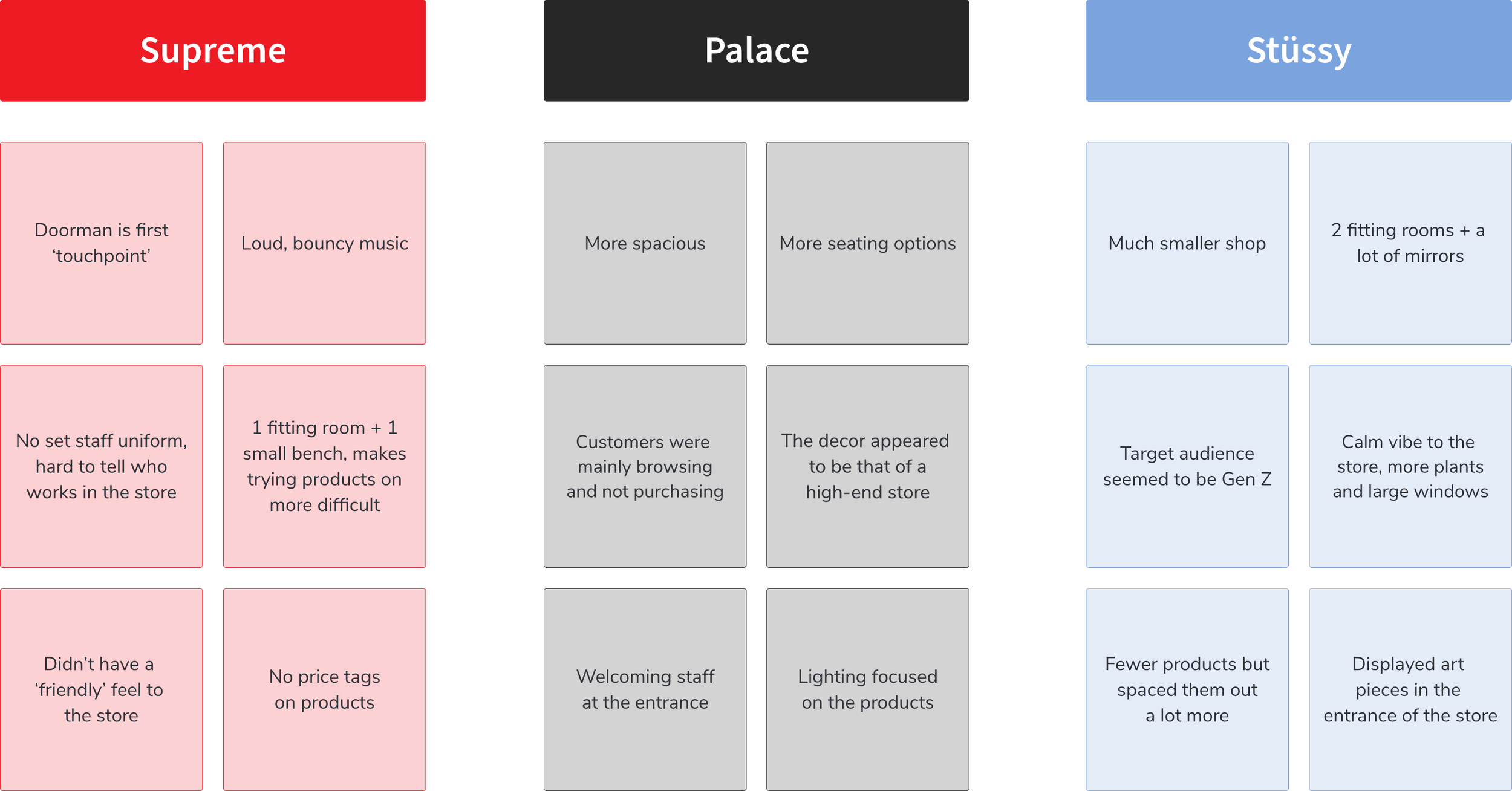
In-Store Review
After comparing each brand online, I wanted to explore how they present themselves in a physical retail setting. Since all three stores, Supreme, Palace, and Stüssy, are located within a five minute walk of each other in central London, this gave me a great opportunity to observe them in person.
During each visit, I paid close attention to subtle elements like the in store atmosphere, music, customer behaviour, and overall vibe. These are details that would have been easy to overlook through photos alone. After each visit, I made quick notes before moving on to the next store to keep my observations fresh and unbiased.
Below are some of the insights I gathered from each visit.
After completing this stage, I felt confident enough in the research to begin exploring perspectives from Supreme’s target audience. I knew I could return to these earlier findings at any point and continue building on them as the project developed.
User Research
Target Audience
I wanted to explore Supreme’s target audience in more depth and understand the type of people who might use my concept. To do this, I interviewed a selection of Supreme consumers, reaching out and speaking with them online.
At this stage, the questions were kept fairly broad. I was more interested in understanding general behaviours such as their traits, goals and frustrations.
From these conversations, I created a set of user personas that helped me form a clearer picture of the average Supreme consumer and who I would be designing for moving forward.


From my research, it became clear that Supreme consumers are not like typical fashion shoppers. For many, buying Supreme is more than just style, it’s an opportunity for profit, with reselling playing a major role in their experience. However, even with the brand’s popularity, the lack of product authenticity across third-party platforms has become a genuine concern. This issue was raised by a large number of people I spoke to, highlighting a clear gap that I could address. It was at this point that I began to see a real opportunity, which would go on to shape the direction of my ideation phase.
Ideation
Main Ideas
Beginning the ideation phase gave me the chance to reflect on all of my previous research and start exploring how those insights could be translated into real, valuable features. I had a strong interest in developing something around the resale experience, but I wasn’t yet sure how to shape that into a clear digital concept.
To help with this, I created a mind map to organise my early thoughts and spark new ideas. Here’s what I came up with:

With the mind-map complete, I began to think more about the logistics of the feature. I wanted to design something that would benefit both buyers and sellers, bring value to Supreme as a brand, and feel like a lasting part of the overall experience, not just a one-off tool.
User Journey
To bring these ideas closer to reality, I mapped out the user journey to understand how both buyers and sellers would interact with this new resale feature. I intended to show the full journey, from listing an item to completing a verified sale.


By mapping out the user journeys for both buyers and sellers, I was able to clearly define how the feature would work in practice. It helped me identify the key touchpoints, streamline each flow, and ensure that the experience was balanced and beneficial for everyone involved.
Design
Wireframing
With the foundations in place, I moved into the design phase — starting with low-fidelity wireframes to explore structure, layout, and core interactions. These early wireframes helped me translate the user journeys into tangible screens and begin shaping how the resale feature would actually function within Supreme's ecosystem.
The main screens I wanted to focus on were the Supreme homepage, advertising the marketplace feature and the homepages for buyer screen and seller screen on the marketplace.

Creating these wireframes gave me a strong foundation to build from and made it much easier to start gathering feedback from Supreme’s audience. I shared the designs in small focus group sessions to understand what was working, what felt unclear, and what features people felt were missing. This early feedback helped guide the next stage of the project and gave me confidence that I was heading in the right direction.
Prototyping
After reviewing the feedback gathered during the wireframing stage, I moved onto prototyping. My aim was to build on the ideas that had been positively received, make improvements where needed, and start shaping the design into something closer to a real product. I also expanded the number of screens to better show how the marketplace would work in more depth and detail.
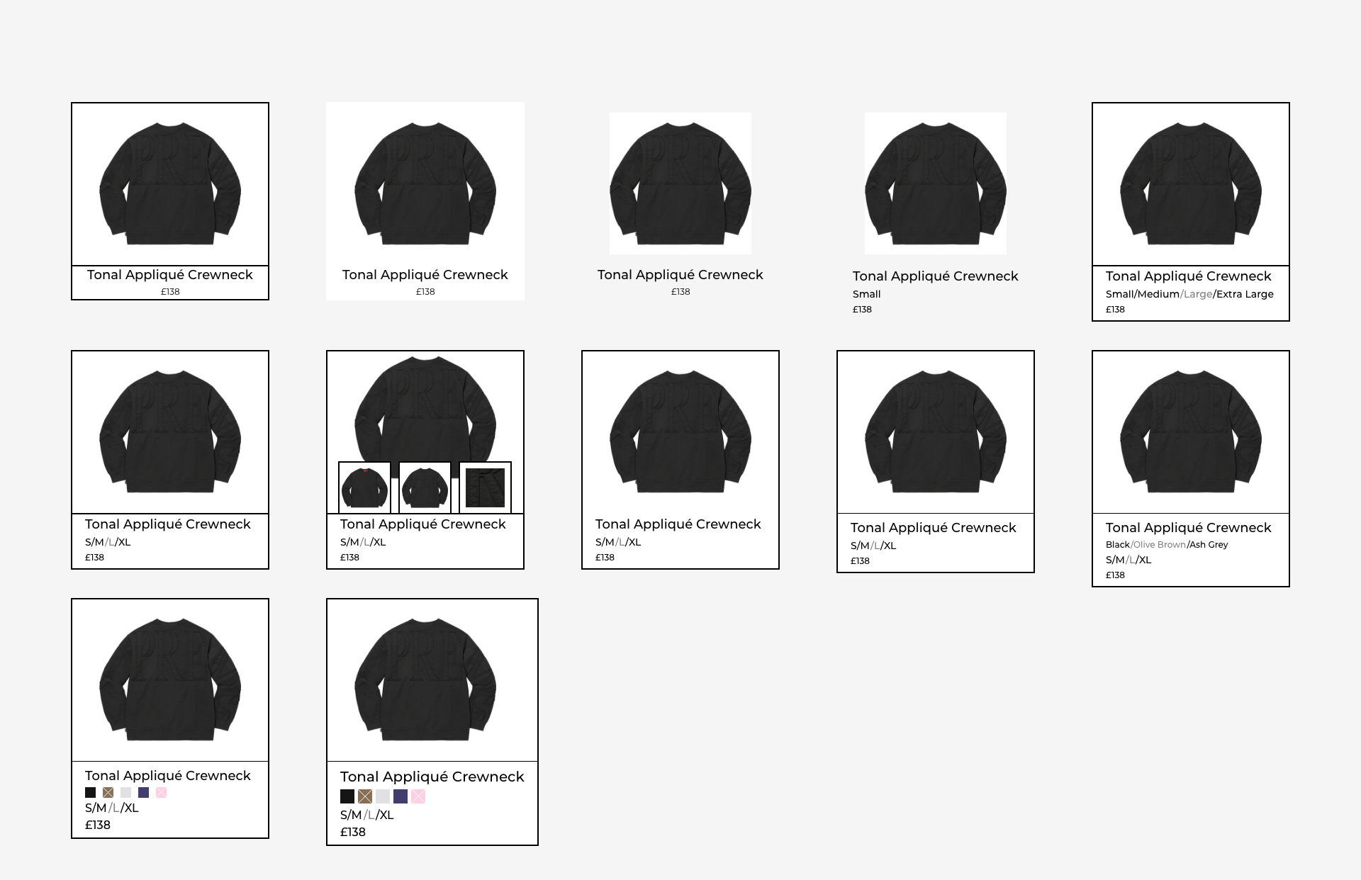
One of these details was how the products were going to be displayed when browsing. I aimed to create it so that all the relevant details were shown whilst simultaneously trying to give the product room to breathe. Therefore, I spent some time designing 12 different ways that the product could be shown, experiementing with them to see what would be the most functional and user-friendly. These are the designs I came up with, settling with the final design.


As I began adding more detail to each screen, the direction of the product started to become much clearer. I also set up a new round of user testing with Supreme consumers to gather feedback on this version of the design. This session focused more on how the product felt to use, whether the screens made sense together and whether the overall flow felt smooth and intuitive. I also wrapped up each session by asking for any suggestions on the visual design or features that could be improved.
User Testing Changes
The feedback I received at this stage was incredibly useful. Users responded positively to the resale concept and its structure, but some mentioned that certain screens felt too plain or lacked energy. Based on this, I focused on improving the visual design, adding more personality, refining layouts, and bringing in elements that felt more in line with Supreme’s identity. These changes helped the product feel less generic and more tailored to the audience it was designed for.


After applying the feedback from the user testing sessions, I made several improvements to the overall design. These included updates to the layout, visual styling, and how users navigated through the marketplace. The product now felt more refined and aligned with what Supreme consumers were looking for. With the structure and experience in place, I felt confident that it was time to move forward and begin designing the final product.
Final Product
After several rounds of feedback, iteration, and testing with Supreme’s audience, I reached a point where the design felt complete. This final version brings together everything I learned throughout the project, from early research and idea exploration to user journeys and design refinement. The result is a resale feature that fits naturally within Supreme’s ecosystem and aims to create a trusted, user-focused marketplace experience.


Although I didn’t have enough time to complete every screen in full detail, I focused my efforts on shaping the homepage as a strong entry point to the resale feature. The idea was to treat it like a shop window, something that would capture attention and reflect the tone of the full experience. While I would have liked to bring more of the core flows to life, this version still captures the key thinking behind the concept and lays the groundwork for how it could be developed further in the future.
Recap
Project Review
This project taught me a lot about managing time and focus across a full design process. Looking back, I spent too much time refining the homepage rather than spreading my attention across the full experience. If I were to approach it again, I would create a dedicated planning document for the design phase, breaking down tasks day by day with clear deadlines to help stay on track. That way, I could make sure the most important parts of the concept are given the attention they need. Still, this project helped me grow in how I apply research to design and how I translate feedback into meaningful changes, all of which I’ll carry into future work.